Are you ready to embark on a creative journey to Design A Logo that truly speaks volumes about your brand?
Crafting a distinctive emblem is a pivotal step in establishing brand identity and fostering brand recognition.
With the right guidance, even beginners can navigate the intricate landscape of logo design with confidence and finesse.
Statistics reveal that a well-designed logo can significantly impact brand perception and consumer behavior.
According to a study by Stanford University, 75% of consumers form judgments about a company’s credibility based on its logo design alone.
Furthermore, research conducted by Nielsen Norman Group suggests that visually appealing logos are more likely to capture consumer attention and evoke positive emotions.
But fret not, for crafting a captivating logo need not be a daunting task. In this comprehensive guide, we’ll unravel the secrets behind creating a compelling logo step by step.
From understanding the fundamentals of design principles to harnessing the power of color psychology, each facet of the logo design process will be demystified.
Embark on this journey armed with curiosity and creativity, and let your imagination run wild.
By the end of this guide, you’ll emerge equipped with the knowledge and skills to craft a logo that not only captivates but also communicates the essence of your brand effectively.
So, roll up your sleeves and let’s dive into the fascinating world of logo design!
Takeaways:
- Understanding the importance of a well-designed logo in brand perception and consumer behavior.
- Learning the step-by-step process of logo design, from fundamentals to implementation.
- Harnessing creativity and imagination to craft a compelling emblem that resonates with your brand’s identity.
What Is A Logo?
A logo is like the face of your brand – it’s the first thing people see and remember.
Designing a logo isn’t just about putting together some fancy graphics; it’s about creating a visual representation of your brand’s identity and values. 🎨
Understanding the Essence:
Logos come in various shapes, sizes, and styles, but their primary purpose remains consistent – to communicate the essence of your brand in a single, memorable image.
Think of iconic logos like the golden arches of McDonald’s or the bitten apple of Apple Inc.
These symbols instantly evoke associations with their respective brands, showcasing the power of effective logo design.
Building Brand Recognition:
A well-crafted logo is more than just a pretty picture; it’s a powerful tool for building brand recognition and establishing a strong brand presence in the market.
According to a study by Nielsen, 64% of consumers say that they trust a brand more if they share values with it.
Your logo serves as a visual cue that reinforces these shared values, fostering a deeper connection with your audience.
Reflecting Your Brand Identity:
Your logo should reflect the unique personality and identity of your brand.
Whether you’re aiming for a sleek and modern look or a playful and whimsical vibe, every element of your logo – from the colors and fonts to the imagery and symbolism – should align with your brand’s overarching identity and message.
Remember, consistency is key when it comes to branding.
Establishing Trust and Credibility:
In today’s crowded marketplace, trust and credibility are invaluable commodities.
A professionally designed logo not only makes your brand look more polished and legitimate but also instills confidence in your audience.
According to a study by the Design Management Institute, companies that prioritize design outperform their competitors by 228% over ten years.
Takeaways:
- A logo is the visual representation of your brand’s identity and values.
- It plays a crucial role in building brand recognition and establishing trust with your audience.
- Your logo should reflect your brand’s unique personality and identity.
- Investing in professional logo design can yield significant returns in terms of credibility and brand perception.
Now that we’ve laid the groundwork for understanding what a logo is and why it’s essential let’s delve into the nitty-gritty of designing a logo that’s both impactful and memorable.
Difference Between Logo, Symbol, And Icon
So, you’re diving into the world of designing a logo, but wait – aren’t logos, symbols, and icons all the same thing?
Not quite! Let’s break down the differences and understand why each plays a unique role in branding. 💡
Logo:
A logo is like the heart of your brand – it encapsulates your entire brand identity into a single visual mark.
It’s the cornerstone of your brand’s visual identity, representing everything from your values and personality to your products and services.
Think of it as the face of your brand that people instantly recognize and associate with your business.
Whether it’s the swoosh of Nike or the golden arches of McDonald’s, logos are iconic symbols that leave a lasting impression.
Symbol:
While a logo is a broader term encompassing various visual elements, a symbol is a specific type of logo that relies on a single, abstract image to convey meaning.
Symbols are powerful because they transcend language barriers and communicate universal concepts and emotions.
For example, the peace sign or the recycling symbol are instantly recognizable symbols that convey messages of peace and sustainability, respectively.
Symbols are versatile and can be used independently or alongside other brand elements to reinforce your brand’s identity.
Icon:
Icons are like the building blocks of visual communication – simple, graphical representations of objects, actions, or concepts. In the context of branding, icons are often used as smaller, secondary elements within a logo or as standalone visual cues to guide users.
They’re concise, memorable, and highly versatile, making them ideal for digital interfaces, signage, and app icons.
For instance, the envelope icon represents email, while the shopping cart icon signifies online shopping.
Icons add visual interest and functionality to your brand identity, enhancing user experience and brand recognition.
Takeaways:
- Logos encompass the entire brand identity into a single visual mark.
- Symbols are specific types of logos that rely on abstract images to convey meaning.
- Icons are simple, graphical representations used as visual cues or secondary elements within a logo.
Understanding the distinctions between logos, symbols, and icons is crucial for creating a cohesive and effective brand identity.
Now that you know the difference, you can confidently embark on your logo design journey and choose the right visual elements to represent your brand!
| Aspect | Logo | Symbol | Icon |
|---|---|---|---|
| Design | Comprehensive representation of brand identity | Abstract image conveying specific meaning | Simple, graphical representation of an object |
| Usage | Primary visual element of brand identity | Often used alongside or as part of a logo | Secondary visual element aiding in recognition |
| Recognition | Highly recognizable and associated with brand | Recognizable but may require context for clarity | Recognizable for its universal meaning or function |
| Flexibility | Can be versatile in application across mediums | May have limitations due to its specific design | Highly adaptable and scalable for various uses |
This table outlines the differences between logos, symbols, and icons in terms of design, usage, recognition, and flexibility.
Why Do You Need A Logo?
So, you’re thinking about designing a logo. But why bother? Isn’t it just a fancy picture slapped on your website or business card?
Oh, it’s so much more than that! Let me break it down for you.
Brand Identity:
Your logo is the face of your brand, the visual representation of everything your business stands for. It’s like your brand’s signature – unique, recognizable, and oh-so-important.
Think about it: when you see that iconic swoosh, who do you think of? Exactly. Your logo sets the tone for your entire brand identity.
First Impressions Matter:
You know what they say – you never get a second chance to make a first impression.
And guess what? Your logo is often the first thing people see when they come across your brand.
A well-designed logo can make you look professional, trustworthy, and downright awesome.
According to a study by Missouri University of Science and Technology, it takes just 2.6 seconds for a viewer’s eyes to land on that area of a website that most influences their first impression.
Yep, that’s how crucial your logo is.
Stand Out From the Crowd:
In today’s crowded marketplace, you need every edge you can get.
A killer logo can help you stand out from the competition and make a lasting impression on potential customers.
It’s your chance to show the world what makes your brand unique – whether it’s your killer sense of humor, your commitment to quality, or your downright coolness factor.
Brand Recognition:
Ever heard of the term “brand recognition”?
That’s fancy marketing speak for “people know who you are just by looking at your logo.” And let me tell you, it’s powerful stuff.
Your logo is like a little ambassador for your brand, popping up wherever your business goes – on your website, your social media profiles, your business cards, heck, even your coffee mug.
The more people see your logo, the more they’ll remember you. It’s like magic, but better.
Takeaways:
- Your logo is the face of your brand and sets the tone for your entire brand identity.
- A well-designed logo can make a strong first impression and build trust with potential customers.
- A unique logo helps you stand out from the competition and makes your brand memorable.
- Consistent use of your logo builds brand recognition and strengthens your brand’s presence in the market.
So, there you have it – the lowdown on why you absolutely, positively need a killer logo for your business. Trust me, it’s worth the investment.
Now go forth and design a logo that’ll knock the socks off your customers! 🚀
Types Of Logos
Alright, let’s dive into the exciting world of logos, shall we? 🎨
Designing a logo isn’t just about slapping together some colors and shapes; it’s about finding the perfect visual representation of your brand’s identity.
And guess what? There are several types of logos to choose from, each with its own unique vibe and purpose. Let’s break it down!
Wordmark Logos
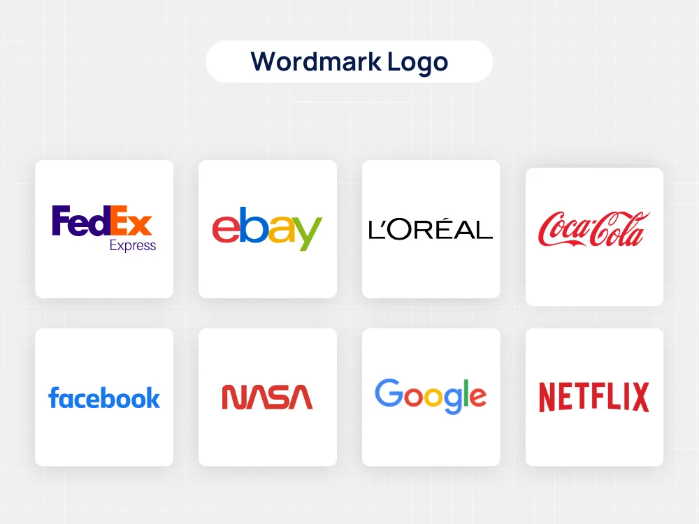
When it comes to designing a logo, one of the first decisions you’ll need to make is what type of logo best suits your brand.
One popular option is the wordmark logo, also known as a logotype. Let’s dive into what makes this type of logo special and how you can leverage it effectively for your brand identity.
What is a Wordmark Logo?
A wordmark logo is a type of logo that consists solely of text, usually the name of the brand or company, stylized in a unique way.
Unlike other types of logos that may include symbols or icons, a wordmark logo relies entirely on typography to convey the brand’s identity.
Examples of Wordmark Logos
Many well-known brands have successfully adopted wordmark logos to represent their identity. Here are a few examples:
- Google: The Google logo, with its colorful and playful lettering, is instantly recognizable and synonymous with the tech giant’s brand.
- Disney: Disney’s wordmark logo features distinctive, whimsical typography that reflects the company’s fun and imaginative brand identity.
- Coca-Cola: The Coca-Cola logo is one of the most iconic wordmark logos in the world, with its classic script lettering evoking a sense of nostalgia and tradition.
Advantages of Wordmark Logos
Wordmark logos offer several advantages that make them a popular choice for brands:
- Brand Recognition: By prominently featuring the brand’s name, wordmark logos help reinforce brand recognition and memorability.
- Clarity: Wordmark logos are straightforward and easy to understand, making them effective for communicating the brand’s identity to consumers.
- Versatility: Wordmark logos can be easily adapted to different mediums and applications, from digital platforms to physical signage.
- Timelessness: A well-designed wordmark logo can stand the test of time, remaining relevant and impactful for years to come.
Tips for Creating a Wordmark Logo
If you’re considering a wordmark logo for your brand, here are some tips to keep in mind:
- Typography Matters: Choose fonts that reflect your brand’s personality and values. Experiment with different typefaces until you find one that resonates with your audience.
- Simplicity is Key: Keep your wordmark logo clean and uncluttered to ensure maximum readability and impact.
- Focus on Legibility: Make sure your logo is legible at various sizes, from small icons to large-scale signage.
- Add a Unique Element: While the focus of a wordmark logo is on the text, consider incorporating subtle design elements or custom lettering to make your logo stand out.
Conclusion
Wordmark logos offer a simple yet powerful way to convey your brand’s identity through typography alone.
By understanding the characteristics and advantages of wordmark logos, you can create a logo that effectively represents your brand and resonates with your target audience.
Lettermark Logos
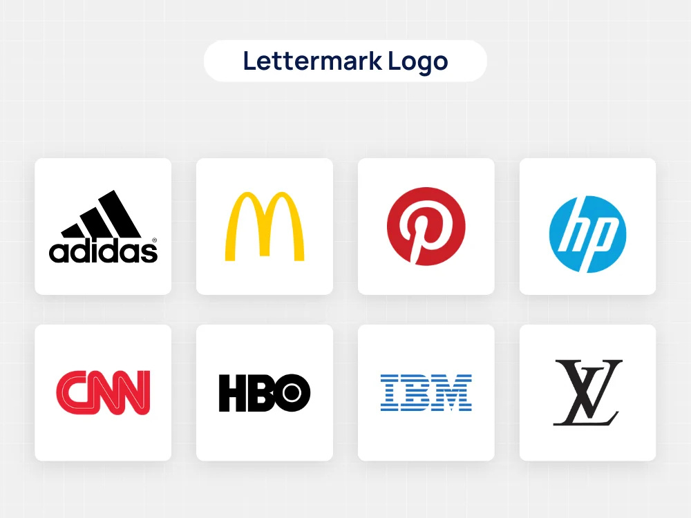
When it comes to designing a logo, there are various types to consider, each with its own unique characteristics and benefits.
One popular option is the lettermark logo, also known as a monogram logo.
Let’s explore what makes lettermark logos special and how they can enhance your brand identity.
What is a Lettermark Logo?
A lettermark logo is a type of logo that consists of the initials or acronym of a brand or company, stylized in a creative and visually appealing way.
Unlike other types of logos that may include symbols or imagery, lettermark logos focus solely on typography to represent the brand.
Examples of Lettermark Logos
Many well-known brands have successfully adopted lettermark logos to establish their identity. Here are a few examples:
- IBM: IBM’s logo features the company’s initials in a simple yet elegant design, reflecting the brand’s reputation for innovation and professionalism.
- NASA: NASA’s lettermark logo uses the organization’s acronym in a bold and futuristic font, symbolizing its pioneering spirit and commitment to space exploration.
- HBO: HBO’s logo consists of the brand’s initials rendered in a distinctive, stylized font, conveying a sense of sophistication and premium entertainment.
Advantages of Lettermark Logos
Lettermark logos offer several advantages that make them a popular choice for brands:
- Simplicity: Lettermark logos are clean and uncluttered, making them easy to recognize and remember.
- Scalability: Because lettermark logos rely on typography, they can be scaled up or down without losing clarity or legibility, making them versatile for various applications.
- Brand Recognition: By prominently featuring the brand’s initials, lettermark logos help reinforce brand recognition and memorability.
- Professionalism: Lettermark logos often convey a sense of professionalism and credibility, making them suitable for businesses and organizations in diverse industries.
Tips for Creating a Lettermark Logo
If you’re considering a lettermark logo for your brand, here are some tips to keep in mind:
- Choose the Right Font: Select a font that reflects your brand’s personality and values. Experiment with different typefaces until you find one that resonates with your target audience.
- Focus on Legibility: Ensure that your logo is easy to read and understand, even at smaller sizes or from a distance.
- Add Visual Interest: While lettermark logos primarily consist of text, consider incorporating subtle design elements or custom lettering to make your logo stand out.
- Stay Timeless: Aim for a design that will remain relevant and impactful for years to come, avoiding trends that may quickly become outdated.
Conclusion
Lettermark logos offer a versatile and effective way to represent your brand through typography alone.
By understanding the characteristics and advantages of lettermark logos, you can create a logo that not only captures the essence of your brand but also leaves a lasting impression on your audience.
Combination Logos
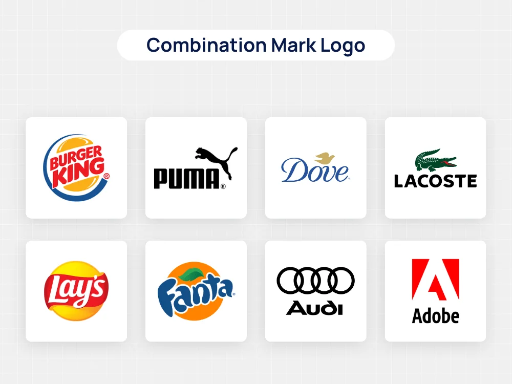
When it comes to designing a logo, one of the most versatile options is the combination logo.
This type of logo combines both text and imagery to create a unique and memorable brand identity.
Let’s delve into what makes combination logos special and how they can benefit your business or brand.
What is a Combination Logo?
A combination logo integrates both text elements (such as the company name or initials) and visual symbols or icons into a single cohesive design.
This blending of textual and graphical elements allows for a flexible and dynamic representation of the brand’s identity.
Examples of Combination Logos
Many well-known brands leverage combination logos to effectively communicate their message and values.
Here are a few examples:
- Nike: Nike’s iconic logo features the brand name alongside the “swoosh” symbol, creating a powerful and instantly recognizable image that represents athleticism and excellence.
- Adidas: Adidas uses a combination logo that includes the brand name along with the three parallel stripes, symbolizing quality and performance in the world of sports apparel.
- Starbucks: Starbucks’ logo combines a wordmark with a stylized image of a mermaid, reflecting the company’s commitment to quality coffee and a welcoming atmosphere.
Advantages of Combination Logos
Combination logos offer several advantages that make them a popular choice for brands:
- Versatility: By incorporating both text and imagery, combination logos can convey the brand’s message in multiple ways, making them suitable for various marketing materials and platforms.
- Memorability: The combination of text and visuals creates a memorable and distinctive logo that is easily recognizable by consumers.
- Brand Storytelling: Combination logos allow brands to tell a story or convey their values through both words and images, fostering a deeper connection with their audience.
- Scalability: When designed effectively, combination logos can be scaled up or down without losing clarity or impact, ensuring consistency across different applications.
Tips for Creating a Combination Logo
If you’re considering a combination logo for your brand, here are some tips to help you get started:
- Balance: Maintain a balance between the text and visual elements of your logo to ensure that neither overshadows the other.
- Simplicity: Keep your design clean and uncluttered, avoiding unnecessary details that may detract from the overall impact of the logo.
- Consistency: Ensure that your combination logo remains consistent with your brand’s identity and message across all marketing channels.
- Flexibility: Design your logo in a way that allows for easy adaptation to different sizes and formats, ensuring that it remains legible and impactful in various contexts.
Conclusion
Combination logos offer a powerful and versatile way to represent your brand, combining the best of both textual and visual elements.
By understanding the characteristics and advantages of combination logos, you can create a logo that effectively communicates your brand’s identity and resonates with your target audience.
Emblem Logos
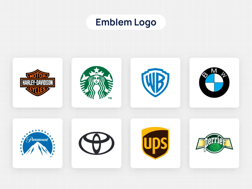
If you’re diving into the world of designing a logo, you might come across a style known as the emblem logo.
These logos have a unique charm, blending text and imagery into a cohesive emblematic design. Let’s explore what emblem logos are all about and why they might be the perfect choice for your brand.
Emblem logos are a classic choice for brands looking to evoke a sense of tradition, prestige, or heritage.
They typically consist of a symbol or icon enclosed within a geometric shape, such as a circle or shield, with the company name or initials integrated into the design.
Characteristics of Emblem Logos
Here are some key characteristics that distinguish emblem logos from other types:
- Integration: Emblem logos seamlessly blend text and imagery into a unified emblematic design, creating a visually striking and cohesive representation of the brand.
- Detail-oriented: Emblem logos often feature intricate details and embellishments, conveying a sense of craftsmanship and attention to detail.
- Historical significance: Many emblem logos draw inspiration from historical symbols or heraldry, imbuing them with a sense of tradition and authenticity.
- Versatility: While emblem logos can be visually complex, they are also highly versatile and can be adapted for various applications and marketing materials.
Examples of Emblem Logos
Numerous well-known brands utilize emblem logos to convey their identity and values effectively.
Here are a few examples:
- Harley-Davidson: The iconic Harley-Davidson logo features a classic emblematic design with a shield shape, incorporating the company name and a stylized bar-and-shield motif.
- BMW: BMW’s logo consists of a circular emblem with the company name encased within two stylized blue and white quadrants, symbolizing the company’s origins in aviation.
- Starbucks: While Starbucks primarily uses a combination logo, its original logo featured a circular emblem with a twin-tailed mermaid encircled by the company name, reflecting its maritime theme and heritage.
Advantages of Emblem Logos
Emblem logos offer several advantages that make them a compelling choice for brands:
- Distinctive: Emblem logos have a unique and memorable appearance, making them stand out in a crowded marketplace.
- Heritage: The traditional and timeless design of emblem logos can convey a sense of heritage, credibility, and trustworthiness to consumers.
- Brand recognition: A well-designed emblem logo can enhance brand recognition and recall, strengthening the brand’s identity and presence in the minds of consumers.
- Versatility: Despite their intricate design, emblem logos are versatile and can be adapted for various applications, from signage to merchandise.
Tips for Creating an Emblem Logo
If you’re considering an emblem logo for your brand, here are some tips to keep in mind:
- Simplicity: While emblem logos can be detailed, strive for simplicity to ensure clarity and legibility, especially at smaller sizes.
- Symbolism: Incorporate symbols or imagery that resonate with your brand’s identity, values, and target audience.
- Typography: Choose complementary fonts and typography that harmonize with the emblem’s design and reinforce the brand’s message.
- Scalability: Design your emblem logo in a way that retains its visual impact and clarity when scaled up or down for different applications.
Conclusion
Emblem logos offer a timeless and distinctive approach to branding, blending text and imagery into a unified emblematic design.
By understanding the characteristics, examples, and advantages of emblem logos, you can create a logo that effectively communicates your brand’s identity, values, and heritage to your audience.
Pictorial Mark Logo
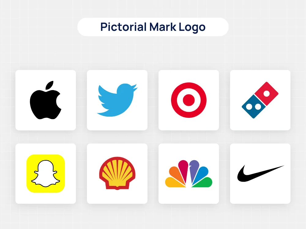
When it comes to designing a logo, one of the key decisions you’ll need to make is what type of logo to create.
One popular option is the pictorial mark logo, also known as a symbol or iconic logo. Let’s explore what makes this type of logo unique and how you can leverage it effectively for your brand.
What is a Pictorial Mark Logo?
A pictorial mark logo is a type of logo that relies primarily on a graphic symbol or icon to represent a brand.
Unlike other types of logos that may incorporate text or typography, a pictorial mark logo is purely visual, using an image to convey the brand’s identity and values.
Examples of Pictorial Mark Logos
Some of the most recognizable brands in the world use pictorial mark logos to represent their identity.
Here are a few examples:
- Apple: The iconic Apple logo, featuring a simple yet memorable image of an apple with a bite taken out of it, is instantly associated with innovation and creativity.
- Twitter: Twitter’s bird logo, known as the “Twitter bird,” is a simple yet effective representation of the platform’s mission to connect people and facilitate communication.
- Shell: The Shell logo, featuring a distinctive shell-shaped symbol, is synonymous with the energy company and is recognized globally.
Advantages of Pictorial Mark Logos
Pictorial mark logos offer several advantages that make them an attractive choice for many brands:
- Memorability: Visual symbols are often more memorable than text-based logos, making pictorial mark logos easier for consumers to recall.
- Versatility: Pictorial mark logos can be used across a variety of mediums and platforms, from print materials to digital assets, without losing clarity or impact.
- Universal Appeal: Because they are not reliant on language or text, pictorial mark logos have universal appeal and can be understood by audiences worldwide.
- Scalability: Pictorial mark logos can be scaled up or down in size without losing quality, making them suitable for use in a range of contexts.
Tips for Creating a Pictorial Mark Logo
If you’re considering a pictorial mark logo for your brand, here are some tips to keep in mind:
- Keep it Simple: Aim for a design that is clean, simple, and easy to recognize at a glance.
- Make it Relevant: Choose a symbol or image that is relevant to your brand’s identity and values.
- Test for Scalability: Ensure that your logo remains clear and legible when scaled down to smaller sizes, such as on social media profiles or business cards.
- Consider Color: Colors can evoke specific emotions and associations, so choose colors that align with your brand’s personality and message.
Mascot Logo
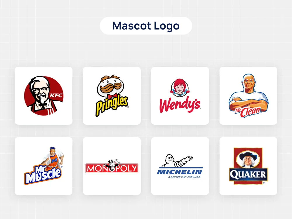
If you’re on the hunt for a logo that’s full of personality and charm, look no further than the mascot logo.
These types of logos bring your brand to life by featuring a character or mascot as the central element.
Let’s dive into what makes mascot logos so special and how you can create one for your own brand.
What is a Mascot Logo?
A mascot logo is a type of logo design that incorporates a character, often anthropomorphic or animal-based, to represent a brand, business, or organization.
These characters are usually depicted in a friendly, approachable manner and serve as the visual embodiment of the brand’s identity and values.
Characteristics of Mascot Logos
Here are some key characteristics that distinguish mascot logos from other types of logos:
- Personality: Mascot logos exude personality and charisma, making them highly memorable and engaging for audiences.
- Versatility: Mascot logos can be adapted to various contexts and marketing materials, from digital platforms to merchandise and packaging.
- Brand association: Mascot logos create strong associations with the brand’s identity, values, and messaging, helping to build brand recognition and loyalty.
- Storytelling: Mascot logos often tell a story or convey a narrative that resonates with the target audience, fostering emotional connections and brand affinity.
Examples of Mascot Logos
Numerous successful brands leverage mascot logos to connect with their audience on a deeper level.
Here are some notable examples:
- KFC: Colonel Sanders, the iconic mascot of KFC, embodies the brand’s heritage, authenticity, and Southern hospitality, becoming synonymous with the company’s image and values.
- Michelin: The Michelin Man, also known as Bibendum, is one of the world’s oldest and most recognizable mascots, symbolizing quality, reliability, and safety in the tire industry.
- Mailchimp: Freddie, the friendly chimpanzee mascot of Mailchimp, adds a playful and whimsical touch to the brand, reflecting its approachable and user-friendly email marketing platform.
Advantages of Mascot Logos
Mascot logos offer several benefits that make them an appealing choice for brands:
- Memorability: Mascot logos are highly memorable and leave a lasting impression on audiences, increasing brand recall and recognition.
- Brand personality: Mascot logos inject personality and character into the brand, helping to humanize the company and forge emotional connections with customers.
- Differentiation: Mascot logos set brands apart from competitors by creating a unique and distinctive visual identity that resonates with the target audience.
- Versatility: Mascot logos can be adapted to various marketing materials and campaigns, allowing brands to maintain consistency across different touchpoints.
Tips for Creating a Mascot Logo
If you’re considering a mascot logo for your brand, here are some tips to guide you through the process:
- Know your audience: Understand your target audience’s preferences, interests, and demographics to create a mascot that resonates with them.
- Keep it simple: While mascot logos can be detailed, avoid overcrowding the design with unnecessary elements. Focus on creating a character that is simple, memorable, and versatile.
- Stay on brand: Ensure that your mascot aligns with your brand’s identity, values, and messaging to maintain consistency and authenticity.
- Test and iterate: Gather feedback from stakeholders and conduct market testing to refine your mascot logo and ensure it resonates with your audience.
Conclusion
Mascot logos are a powerful branding tool that can bring your brand to life and create meaningful connections with your audience.
By understanding the characteristics, examples, and advantages of mascot logos, you can create a memorable and engaging logo that embodies your brand’s identity and values.
Takeaways:
- Wordmark logos focus on typography for brand recognition.
- Lettermark logos use initials or abbreviations for a sleek monogram.
- Symbol logos rely solely on visual imagery for universal appeal.
- Combination logos merge typography and imagery for versatility.
- Emblem logos encapsulate brand name and imagery within a unified emblem.
Now that you know the different types of logos, it’s time to roll up your sleeves and get creative!
Whether you opt for a wordmark, symbol, or something in between, remember to stay true to your brand’s identity and values.
After all, your logo is the visual embodiment of everything your brand stands for – so make it count!
How To Design A Logo
So, you’ve got this awesome idea for a brand, and now you’re itching to design a logo that screams “I’ve arrived!”
Well, my friend, you’re in luck because I’m about to spill the beans on how to create a logo that’s as epic as your brand itself. Let’s get started! 🚀
1. Know Thyself:
Before you dive headfirst into the world of logo design, take a moment to reflect on your brand’s identity. What sets you apart from the competition?
What values do you hold dear? Understanding your brand inside and out is the key to crafting a logo that truly resonates with your audience.
2. Keep It Simple:
Repeat after me: simplicity is king. A cluttered, overly complex logo will only confuse and alienate your audience.
Instead, aim for a clean, minimalist design that gets straight to the point. Remember, some of the most iconic logos in history – think Nike’s swoosh or Apple’s bitten apple – are also the simplest.
3. Get Inspired:
Don’t reinvent the wheel – borrow a spoke or two from logos that inspire you. Take a stroll through the annals of design history, gather inspiration from your favorite brands, and put your own unique spin on things.
Just remember, inspiration is a muse, not a blueprint – make sure your logo stands out from the crowd.
4. Color Me Happy:
Ah, the wonderful world of color. Choose wisely, my friend, for color can make or break your logo.
Consider the emotions you want to evoke – red for passion, blue for trust, green for growth – and select hues that align with your brand’s personality.
And hey, don’t be afraid to experiment – sometimes the most unexpected color combinations yield the best results.
5. Typography Matters:
Believe it or not, the font you choose can speak volumes about your brand.
Whether you opt for a sleek sans-serif or a quirky handwritten script, make sure your typography reflects your brand’s tone and personality.
And hey, don’t forget about legibility – no one likes squinting at a logo they can’t read.
6. Test, Test, Test:
Once you’ve got a draft of your logo, it’s time to put it to the test. Show it to friends, family, even strangers on the street, and gather feedback like a sponge.
Does it resonate with your audience? Does it accurately reflect your brand’s identity? Use this feedback to fine-tune your design until it’s as perfect as can be.
7. Make It Scalable:
Last but not least, make sure your logo looks just as good on a billboard as it does on a business card.
Keep scalability in mind when designing your logo, opting for simple shapes and clean lines that won’t blur or distort when resized.
After all, you never know where your brand might take you – aim for the stars!
Takeaways:
- Know your brand inside and out before diving into logo design.
- Keep your logo simple and clean for maximum impact.
- Draw inspiration from iconic logos but put your own unique spin on things.
- Choose colors and typography that reflect your brand’s personality and tone.
- Test your logo with real people and gather feedback to refine your design.
- Ensure your logo is scalable and looks great across all mediums.
And there you have it – the ultimate guide to designing a logo that’s as epic as your brand itself. Now go forth and unleash your creativity – the world is waiting for your masterpiece!
What Not To Do When Designing A Logo?
Alright, aspiring logo designers, listen up! I’m here to spill the tea on what not to do when designing a logo. Avoid these common pitfalls like the plague, and you’ll be well on your way to logo design glory.
Let’s dive in, shall we? 💥
1. Don’t Follow Trends Blindly:
Sure, trendy logos may seem cool today, but what about tomorrow? Trends come and go like the wind, and if your logo is a slave to the latest fad, it’ll quickly become outdated.
Instead, focus on timeless design principles that stand the test of time. Your logo should be a beacon of longevity, not a passing fad.
2. Don’t Overcomplicate Things:
Repeat after me: simplicity is key. Your logo should be clean, clear, and instantly recognizable – not a cluttered mess that leaves people scratching their heads.
Avoid cramming too many elements into your design, and opt for simplicity over complexity.
Remember, less is more when it comes to logo design.
3. Don’t Forget Scalability:
Picture this: you’ve designed the perfect logo, only to realize it looks like a pixelated mess when scaled down to fit on a business card.
Yikes! Always consider scalability when designing your logo, ensuring it looks just as good on a billboard as it does on a postage stamp. Keep your design simple and clean to avoid distortion at different sizes.
4. Don’t Underestimate Color Psychology:
Colors aren’t just pretty – they’re powerful tools for conveying emotion and meaning. Choose your colors wisely, considering the message you want to convey and the emotions you want to evoke.
And hey, don’t forget about color blindness – make sure your logo is accessible to everyone, regardless of their color vision.
5. Don’t Ignore Feedback:
You may think your logo is the bee’s knees, but what do other people think? Solicit feedback from friends, family, and even strangers on the street, and listen to their input with an open mind.
Constructive criticism is your best friend when it comes to logo design, helping you refine your design until it’s as polished as can be.
6. Don’t Rush The Process:
Rome wasn’t built in a day, and neither is a great logo. Take your time, experiment with different concepts, and don’t settle for anything less than perfection.
Remember, your logo is the face of your brand – it deserves the time and attention it takes to get it just right.
Takeaways:
- Avoid blindly following design trends that may quickly become outdated.
- Keep your logo design simple and avoid cluttering it with unnecessary elements.
- Ensure your logo is scalable and looks good at different sizes.
- Choose colors wisely, considering their psychological impact and accessibility.
- Listen to feedback from others and use it to improve your design.
- Take your time and don’t rush the logo design process.
And there you have it – the ultimate guide to what not to do when designing a logo. Steer clear of these common mistakes, and you’ll be well on your way to creating a logo that stands the test of time.
Now go forth and design with confidence!
Examples Of A Good Logo
Alright, folks, time to feast your eyes on some prime examples of what it means to have a kick-ass logo.
These bad boys aren’t just eye candy – they’re shining beacons of branding brilliance that’ll make you want to stand up and slow clap.
Let’s take a closer look, shall we? 👀
1. Nike:
When it comes to iconic logos, few can rival the global recognition and impact of Nike’s emblem. Let’s delve into what makes Nike’s logo a shining example of effective design.
Nike’s Swoosh logo, introduced in 1971, is a masterclass in simplicity. Its clean lines and minimalist approach make it instantly recognizable, even when stripped down to its basic form. The simplicity of the design allows it to be versatile, appearing on everything from shoes to apparel to advertisements.
Symbolism: The Swoosh embodies movement and speed, reflecting Nike’s core values of athleticism and performance. It evokes a sense of energy and forward motion, resonating with athletes and consumers alike.
Memorability: Nike’s logo is etched into the collective consciousness of millions worldwide. Its simplicity and distinctiveness make it easy to remember, reinforcing brand recall and loyalty.
Timelessness: Despite evolving trends in design, the Nike Swoosh has stood the test of time. Its enduring appeal transcends generations, remaining relevant and impactful decades after its inception.
Versatility: From high-profile sports events to everyday streetwear, the Nike logo seamlessly adapts to various contexts and mediums. Its adaptability ensures consistent brand representation across diverse platforms.
Emotional Connection: Beyond its visual appeal, the Nike logo elicits emotional responses from consumers. It symbolizes determination, aspiration, and the pursuit of excellence, fostering a deep connection with the brand.
In conclusion, Nike’s logo exemplifies the power of simplicity, symbolism, and versatility in effective logo design. It serves as an enduring testament to the brand’s commitment to innovation and inspiration in the world of sports and beyond.
2. Apple:
When discussing iconic logos, it’s impossible to overlook Apple’s famous bitten apple symbol. Let’s explore what makes Apple’s logo a standout example of effective design.
Simplicity: Apple’s logo is a prime example of simplicity at its finest. The sleek silhouette of a partially bitten apple is instantly recognizable and easy to remember. Its minimalist design embodies the brand’s commitment to elegance and innovation.
Versatility: Despite its simplicity, the Apple logo is incredibly versatile. It can be scaled up or down without losing its impact, making it suitable for a wide range of applications, from product packaging to digital media.
Brand Identity: Over the years, the Apple logo has become synonymous with quality, innovation, and cutting-edge technology. It serves as a visual representation of the brand’s ethos and values, helping to reinforce its identity in the minds of consumers.
Memorability: The bitten apple symbol has achieved near-universal recognition, thanks to Apple’s global presence and marketing efforts. Its distinctiveness sets it apart from competitors, ensuring that it remains etched in the memories of consumers worldwide.
Emotional Connection: Beyond its visual appeal, the Apple logo evokes emotions and associations with the brand. It symbolizes creativity, passion, and the pursuit of excellence, fostering a sense of loyalty and admiration among Apple enthusiasts.
Timelessness: Despite undergoing minor revisions over the years, the core elements of the Apple logo have remained consistent. Its enduring design has stood the test of time, remaining relevant and impactful in an ever-changing landscape.
In conclusion, Apple’s logo exemplifies the power of simplicity, versatility, and brand identity in effective logo design. It serves as a testament to the brand’s unwavering commitment to excellence and innovation, leaving a lasting impression on consumers worldwide.
3. McDonald’s:
When it comes to iconic logos, few can rival the golden arches of McDonald’s. Let’s delve into what makes this logo a shining example of effective design.
Recognizability: The golden arches are instantly recognizable worldwide. Whether you’re in New York City or Tokyo, the sight of those familiar arches conjures up images of delicious burgers and fries. This level of recognizability is a testament to the logo’s enduring appeal and universal appeal.
Memorability: McDonald’s logo is not just recognizable; it’s also incredibly memorable. The bold, curved shape of the arches sticks in the mind long after you’ve seen it, making it easy for customers to recall the brand when hunger strikes.
Brand Association: Beyond its visual appeal, the McDonald’s logo is closely associated with the brand’s values and offerings. It symbolizes affordability, convenience, and the joy of sharing a meal with friends and family. This association helps build trust and loyalty among customers, keeping them coming back for more.
Timelessness: Despite undergoing minor revisions over the years, the core elements of the McDonald’s logo have remained consistent. This timeless quality ensures that the logo remains relevant and impactful, even as design trends come and go.
Global Appeal: McDonald’s operates in over 100 countries, and its logo transcends cultural and linguistic barriers. The simple, universally understood symbol of the golden arches makes it easy for customers around the world to identify and connect with the brand.
Adaptability: One of the strengths of the McDonald’s logo is its adaptability. Whether it’s printed on a sign, displayed on packaging, or featured in a digital advertisement, the logo maintains its impact and clarity across various mediums and formats.
In conclusion, the McDonald’s logo is a shining example of effective design, thanks to its recognizability, memorability, brand association, timelessness, global appeal, and adaptability. It serves as a visual beacon for the brand, drawing customers in with the promise of delicious food and a memorable experience.
4. FedEx:
When it comes to iconic logos, the FedEx logo stands out as a prime example of effective design. Let’s explore what makes the FedEx logo so successful and memorable.
Simplicity: The FedEx logo is simple yet highly effective. With just a bold, purple “Fed” followed by a sleek “Ex” in orange, the logo conveys the brand’s identity in a clean and straightforward manner. This simplicity makes it easy for customers to recognize and remember the FedEx brand.
Hidden Message: One of the most ingenious aspects of the FedEx logo is the hidden arrow between the letters “E” and “x”. This subtle design element symbolizes speed, precision, and efficiency, perfectly aligning with FedEx’s core values as a logistics company. The inclusion of this hidden message adds depth and intrigue to the logo, engaging viewers and inviting them to discover more about the brand.
Color Choice: The use of bold purple and vibrant orange in the FedEx logo is both eye-catching and distinctive. Purple is often associated with luxury, creativity, and innovation, while orange conveys energy, enthusiasm, and friendliness. Together, these colors create a visually striking logo that commands attention and leaves a lasting impression on viewers.
Versatility: Despite its simplicity, the FedEx logo is incredibly versatile and adaptable. Whether it’s printed on delivery trucks, uniforms, or digital screens, the logo retains its impact and clarity across various mediums and formats. This versatility ensures consistent branding and recognition for FedEx, regardless of where their logo appears.
Timelessness: Since its introduction in 1994, the FedEx logo has remained largely unchanged. This timelessness speaks to the enduring appeal and effectiveness of the design. By avoiding trendy elements and sticking to timeless principles of design, FedEx has created a logo that remains relevant and impactful even decades later.
In conclusion, the FedEx logo exemplifies the principles of effective logo design, with its simplicity, hidden message, color choice, versatility, and timelessness setting it apart as a true masterpiece of branding. It serves as a powerful symbol of the FedEx brand, conveying its values and identity to customers around the world.
5. Coca-Cola:
When it comes to iconic logos, few can rival the timeless appeal of the Coca-Cola logo. Let’s delve into what makes the Coca-Cola logo a shining example of effective design.
Historical Significance: The Coca-Cola logo is not just a symbol of a beverage; it’s a cultural icon with a rich history spanning over a century. Since its inception in 1886, the Coca-Cola logo has undergone subtle modifications but has retained its essence, making it instantly recognizable to people of all ages across the globe.
Bold Typography: One of the key elements of the Coca-Cola logo is its distinctive typography. The bold, flowing script font used for the brand name exudes warmth, friendliness, and familiarity. This unique typeface sets Coca-Cola apart from its competitors and evokes a sense of nostalgia, reminding consumers of cherished memories associated with the brand.
Iconic Red Color: The vibrant red color of the Coca-Cola logo is synonymous with the brand and has become deeply ingrained in popular culture. Red is known to evoke emotions such as passion, excitement, and energy, making it the perfect choice for a brand that aims to spread happiness and joy. The use of red in the Coca-Cola logo not only grabs attention but also creates a strong visual identity that is instantly memorable.
Global Recognition: One of the most remarkable aspects of the Coca-Cola logo is its universal appeal. Regardless of language, culture, or geographic location, the Coca-Cola logo transcends barriers and is universally understood and appreciated. This global recognition is a testament to the power of effective branding and the enduring impact of the Coca-Cola logo.
Adaptability: Over the years, the Coca-Cola logo has seamlessly adapted to various marketing campaigns, seasonal promotions, and cultural events while maintaining its core identity. Whether it’s the iconic contour bottle silhouette or the classic script logo, Coca-Cola has demonstrated the versatility of its branding, ensuring relevance and resonance with consumers around the world.
In conclusion, the Coca-Cola logo is a shining example of effective logo design, combining historical significance, bold typography, iconic color choice, global recognition, and adaptability. It serves as a timeless symbol of joy, optimism, and togetherness, embodying the spirit of the Coca-Cola brand for generations to come.
6. Google
Google’s logo is a prime example of effective logo design that has become ingrained in our daily lives. Let’s explore what makes Google’s logo stand out from the crowd.
Simplicity: The Google logo is refreshingly simple yet instantly recognizable. Consisting of vibrant primary colors and clear, sans-serif typography, it embodies the minimalist design principles that have become synonymous with the brand. This simplicity allows the logo to be easily scalable across various platforms and sizes without losing its impact.
Playfulness: Google’s logo exudes a sense of playfulness and whimsy, reflecting the company’s innovative and creative spirit. The use of bright colors and unconventional letter shapes, such as the tilted ‘e’, adds personality to the logo and captures the essence of Google’s brand identity as a fun and approachable tech giant.
Evolution: Over the years, Google’s logo has undergone subtle yet significant changes, reflecting the company’s evolution and growth. From its humble beginnings in 1998 to the sleek, modern design we see today, each iteration of the logo tells a story of innovation, adaptability, and progress.
Brand Consistency: Despite its evolution, Google has maintained consistency in its branding, ensuring that the logo remains instantly recognizable to users around the world. Whether it’s displayed on a search engine results page, a mobile app, or a physical product, the Google logo serves as a consistent symbol of reliability and trust.
Global Impact: With a presence in over 220 countries and territories, Google’s logo has achieved global recognition and has become a ubiquitous symbol of the internet age. Its widespread use across various products and services has cemented Google’s position as a leading tech company and a driving force behind digital innovation.
In conclusion, Google’s logo exemplifies the principles of effective logo design, including simplicity, playfulness, evolution, brand consistency, and global impact. As one of the most recognizable logos in the world, it serves as a testament to the power of thoughtful design in shaping brand identity and leaving a lasting impression on audiences worldwide.
7. Amazon
When it comes to iconic logos, few can rival the simplicity and effectiveness of Amazon’s logo. Let’s delve into what makes Amazon’s logo a shining example of successful design.
Simplicity: Amazon’s logo is a masterpiece of simplicity. With just a curved arrow connecting the letters ‘A’ and ‘Z’, the logo conveys the message that Amazon offers everything from A to Z. This simplicity not only makes the logo instantly recognizable but also ensures that it remains memorable to customers.
Meaningful Symbolism: The arrow in Amazon’s logo serves multiple purposes. Firstly, it represents the company’s vast selection of products, symbolizing the idea of endless possibilities. Secondly, the arrow is cleverly designed to resemble a smile, reflecting Amazon’s commitment to customer satisfaction and happiness.
Scalability: One of the hallmarks of a good logo is its ability to scale effectively across various platforms and sizes. Amazon’s logo excels in this regard, maintaining its clarity and impact whether it’s displayed on a website, a mobile app, or a physical package. This versatility ensures that the logo retains its effectiveness across different mediums.
Adaptability: Over the years, Amazon’s logo has undergone subtle changes to adapt to evolving design trends and branding strategies. However, the core elements of the logo, such as the arrow and the font, have remained consistent, allowing Amazon to maintain brand recognition while staying relevant in a rapidly changing marketplace.
Global Appeal: With a presence in over 180 countries, Amazon’s logo has achieved global recognition and has become synonymous with e-commerce worldwide. Its universal appeal transcends language and cultural barriers, making it one of the most recognizable logos in the world.
In conclusion, Amazon’s logo is a shining example of effective design that embodies the principles of simplicity, meaningful symbolism, scalability, adaptability, and global appeal. By understanding and implementing these principles in your own logo design process, you can create a memorable and impactful logo that resonates with your target audience.
Takeaways:
- Good logos are instantly recognizable and memorable.
- They embody the brand’s ethos and values.
- Simple designs are often the most effective.
- Clever hidden elements can add depth and intrigue to a logo.
- Timeless designs stand the test of time and transcend trends.
So there you have it – five stellar examples of what it means to have a good logo. Whether you’re swooning over the Nike swoosh or craving a Big Mac, these logos prove that great design knows no bounds.
Now go forth and get inspired – the world is waiting for your logo masterpiece!
Free And Paid Logo Design Courses
Free Logo Design Courses
- GFXMentor: is a popular YouTube channel and online platform that offers tutorials and resources related to graphic design, photography, and video editing.
- Gareth David Studio: is a design and creative studio founded by Gareth David, a designer and educator known for his expertise in graphic design and web development.
- Creative Minds Factory: They Teach Practice Branding and Logo Design with 100% Real projects. We show how a Branding Studio does it. We Post RAW logo design video, which is very useful for Logo Designers
- DesignCourse: Teach full-stack development! This means you will see tutorials regarding UI/UX, Frontend Dev, Backend Dev, Graphic Design, and more!
Paid Logo Design Courses
- Logo Design with Draplin: Secrets of Shape, Type, and Color
- Logo Design Mastery: The Full Course
- Iconic Logo Design: Brainstorm & Refine Unique Concepts
- Logo Design Workflow: Creating Timeless and Modern Logos
Top Designers To Follow On Social Media
- Milton Glaser (@MiltonGlaserInc): Known for the “I ♥ NY” logo, Milton Glaser’s design prowess is unmatched. Keep up with his influential work on Facebook: Facebook.
- Ellen Lupton (@ellenLupton): As a renowned design educator and curator, Ellen Lupton shares her design expertise on Pinterest, offering a treasure trove of design inspiration and resources: Pinterest.
- Lance Wyman (@LanceWymanNews): Lance Wyman’s iconic work includes the 1968 Mexico City Olympics logo. Stay updated with his design journey on Instagram, where he continues to push the boundaries of visual identity: Instagram.
- Luba Lukova (@lubalukova): Luba Lukova’s socially conscious and thought-provoking design work is showcased on Twitter, where she highlights the power of visual communication in addressing global issues: Twitter.
Conclusion
Congratulations, dear reader, you’ve made it to the end of our epic journey through the world of logo design! 🎉
It’s been a wild ride, full of twists, turns, and more than a few “aha” moments along the way. But fear not, for your quest to create the perfect logo is far from over. In fact, it’s only just begun!
Reflecting on Your Journey
As you reflect on everything you’ve learned, take a moment to pat yourself on the back.
You’ve delved into the intricacies of color theory, explored the depths of typography, and even dipped your toes into the waters of symbolism and storytelling.
You’ve armed yourself with the tools and knowledge you need to tackle the daunting task of logo design head-on.
Embracing Your Creativity
But remember, dear reader, that while the journey may be long and winding, the destination is well worth the effort.
So don’t be afraid to let your creativity run wild, to think outside the box, and to push the boundaries of what’s possible.
After all, it’s often the most daring and innovative ideas that lead to the most memorable and impactful logos.
Continuing Your Education
And don’t forget, your journey doesn’t end here. In fact, it’s only just beginning. There’s always more to learn, more techniques to master, and more inspiration to draw from.
So keep exploring, keep experimenting, and keep honing your craft. Who knows what amazing creations lie just around the corner?
Taking the Leap
So go forth, dear reader, and unleash your creativity upon the world. Whether you’re designing a logo for a small business, a nonprofit organization, or even just for fun, know that you have the power to make a difference.
Your logo has the potential to inspire, to inform, and to captivate – so make it count.
Final Words of Encouragement
And finally, remember this: designing a logo may seem like a daunting task, but with passion, perseverance, and a healthy dose of creativity, anything is possible.
So go forth, my friend, and design the logo of your dreams. The world is waiting.
Takeaways
- Creativity knows no bounds: Don’t be afraid to think outside the box and push the limits of your imagination.
- Continuous learning is key: Keep exploring new techniques, trends, and technologies to stay ahead of the curve.
- Your logo has the power to make a difference: Whether it’s for a business, an organization, or just for fun, your logo has the potential to leave a lasting impression.
- Believe in yourself: With passion, perseverance, and a sprinkle of creativity, you can achieve anything you set your mind to.
And with that, dear reader, I bid you adieu. May your journey be filled with creativity, inspiration, and countless “aha” moments. Until we meet again, happy designing! 🎨✨
FAQs
1. How important is it to have a logo for my business?
Having a logo for your business is crucial as it serves as the visual representation of your brand. It helps create brand recognition, instills trust in your audience, and sets you apart from competitors. A well-designed logo can leave a lasting impression on customers and contribute to the overall success of your business.
2. Can I design my logo myself?
Yes, absolutely! With the right tools and guidance, designing your own logo is entirely possible. There are plenty of online resources, tutorials, and design software available that cater to beginners. However, if you’re not confident in your design skills, hiring a professional designer may be a better option.
3. What elements should I consider when designing a logo?
When designing a logo, it’s essential to consider factors such as color, typography, shape, and symbolism. Each element plays a significant role in conveying your brand’s message and values effectively. Strive for simplicity, versatility, and memorability to create a logo that stands the test of time.
4. How can I ensure my logo reflects my brand identity?
To ensure your logo reflects your brand identity, start by defining your brand’s personality, values, and target audience. Incorporate elements that resonate with your brand’s story and message. Experiment with different design concepts until you find one that encapsulates the essence of your brand.
5. What are some common mistakes to avoid when designing a logo?
Common mistakes to avoid when designing a logo include using too many colors or fonts, creating a logo that’s overly complex, and neglecting scalability and versatility. It’s also essential to steer clear of trends that may quickly become outdated and to ensure your logo is unique and memorable.
6. Should I use symbols or icons in my logo?
Using symbols or icons in your logo can be a powerful way to convey meaning and establish visual recognition. However, it’s essential to choose symbols that align with your brand’s message and values. Avoid using generic symbols and opt for ones that have personal significance or relevance to your industry.
7. How do I choose the right colors for my logo?
When choosing colors for your logo, consider the psychological associations of different colors and how they align with your brand’s identity. Think about the emotions you want to evoke in your audience and select colors that convey those feelings effectively. It’s also essential to consider color contrast and readability to ensure your logo is visually appealing across various platforms.
8. What role does typography play in logo design?
Typography plays a crucial role in logo design as it helps communicate your brand’s personality and values. Choose fonts that are legible, versatile, and reflective of your brand’s identity. Experiment with different typefaces and font pairings to find the perfect combination that enhances your logo’s overall aesthetic.
9. How do I ensure my logo is scalable?
To ensure your logo is scalable, design it using vector graphics rather than raster images. Vector graphics can be scaled up or down without losing quality, making them ideal for logos that need to appear across various platforms and sizes. Test your logo at different sizes to ensure it remains clear and legible in all contexts.
10. Should my logo include my business name?
Whether or not to include your business name in your logo depends on your brand’s identity and recognition. If your business name is well-established and easily recognizable, incorporating it into your logo can reinforce brand recall. However, if your business name is long or difficult to remember, opting for a symbol-based logo may be more effective.
11. How do I ensure my logo is unique?
To ensure your logo is unique, conduct thorough research to avoid inadvertently copying existing designs. Invest time in brainstorming and conceptualizing ideas that are original and distinctive to your brand. Consider hiring a professional designer to create a custom logo tailored specifically to your business.
12. Can I trademark my logo?
Yes, you can trademark your logo to protect it from unauthorized use by competitors. Trademarking your logo provides legal protection and exclusive rights to use it in connection with your products or services. Consult with a trademark attorney to navigate the trademark registration process and ensure your logo meets the necessary criteria for protection.
13. How often should I update my logo?
The frequency of updating your logo depends on various factors, including changes in your brand’s identity, market trends, and industry standards. While some brands opt to refresh their logos periodically to stay relevant, others maintain consistency to build brand recognition over time. Consider updating your logo if it no longer aligns with your brand’s values or if it’s hindering your business’s growth.
14. What file formats should I use when saving my logo?
When saving your logo, it’s essential to use file formats that support scalability and maintain quality across different platforms and devices. Save your logo in vector formats such as SVG, EPS, or AI for scalability and versatility. Additionally, consider exporting raster versions in formats like PNG or JPEG for use on the web or in print.
15. How do I get feedback on my logo design?
To gather feedback on your logo design, consider sharing it with friends, family, colleagues, or members of your target audience. Alternatively, join online design communities or forums where you can seek constructive criticism from fellow designers and professionals. Use feedback to refine and iterate on your design until you’re satisfied with the final result.
NameHassle.com - Your Ultimate Domain Name Generator
Discover the Perfect Domain Name for Your Online Adventure with NameHassle.
Effortlessly generate creative and available domain names in seconds. Say goodbye to domain naming hassles and start building your online presence today!
You've Chosen A Business Name. Now What?
Congratulations on selecting your business name!
Now, take the next exciting steps: secure a domain to establish your online presence, create a logo that captures the essence of your brand, and craft a slogan that embodies your values.
Don't forget to trademark your unique brand identity, safeguarding your brand's future.
Ready to make your business name unforgettable? Let's get started on this journey! 🚀
To further enhance your brand, explore:

